Learn the Expert Secrets Behind Apartment Logo Design
Arguably the most important feature of any branding effort, apartment logo design is an oft-misunderstood art.
Logo design isn’t as simple as sketching at random and hoping for the best, nor is it simply waiting for inspiration to hit you out of the blue. Apartment logo design should be strategic, thoughtful, and yes, even aesthetically pleasing.

When branding for multifamily, logos can often become complex — the logo not being just the extension of the building or its amenities but also of the community, the culture, and the reputation. In short, branding a multifamily project is critical to its success.
There is no easy way to ensure your multifamily branding project will bring the success you desire; however, there are three simple steps you can take to ensure your logo design is as successful as possible:
1. Concepting Your Idea
Establish the “feel” first. What kind of organization are you designing for? Obviously, as a multifamily development, you may have different brand needs than a hip new restaurant, but dig even further than that. Know your property and which people need to be involved.
Things to think about include:
- What is the internal culture?
- What is the public-facing culture?
- What separates you from other similar properties?
A great way to answer all these questions is to start with word exercises; a mind map can help you make a connection you didn’t see at first. All of these elements need to be represented in some way with the brand as a whole.
Every great design starts with knowing your demographic as well. You also need to ask yourself: who, what, where, when, and why.
- WHO: Who is your property? Who is your competition? Who is your target audience?
- WHAT: What differentiators does your property offer? What are you trying to achieve or what emotion are you trying to evoke?
- WHERE: Where is the property located?
- WHEN: When will the property be ready for leasing?
- WHY: Why should residents rent here and not another property?
If you followed the multifamily inbound marketing strategy correctly, your teams all came together to identify your buyer persona. Doing this should have resulted in defining your lead lifecycle stage and identifying the answers to all the above questions.
If you have not done this, go back and do it now because this data is vital to your brand identity.
The apartment logo is one of the first aspects of your property that people see, and it shows on every piece of a multifamily brand. Be sure to make a good first impression.
2. Just Keep Sketching
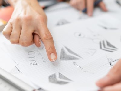
Sketch, sketch, sketch. It’s highly unlikely that any great (or even good) apartment logo design has ever been developed start-to-finish on a screen. Pencil and paper are still the best free-form way to get ideas started.
Remove any ideas of “pixel perfection” or perfect lines and fully rendered visuals, as this allows you to think more fluidly and discover ideas that might have been missed if the first step were to fire up Illustrator.
Only after sketching, more sketching, pulling the interesting ideas out from the boring ones, and refining the sketches should you turn to your software tools. That apartment logo should be designed in the program of your choice that allows for fully scalable vector art. Designing something in pixels in Photoshop might be fine for now, but what happens when that apartment logo needs to be scaled? Always be conscious of future needs.
Think about applications. An apartment logo always looks great on a blank white page with nothing else competing. Consider the following:
- How is that mark going to be used?
- Does it look good in a one-color variant for black-and-white printing?
- What about reversed out over a dark background?
- How much clearspace does it require not to get lost in a busy application?
- What if it needs to be really large or really small?
- Does it scale well?
3. Presentation Is Everything
Presentation is key. Whether you are presenting the apartment logo to the property management team, owners, or other marketing team members, your logo should be presented without any ornamentation or competing elements — then show the applications. Black, white, and alternate brand colors — if providing a logo system.
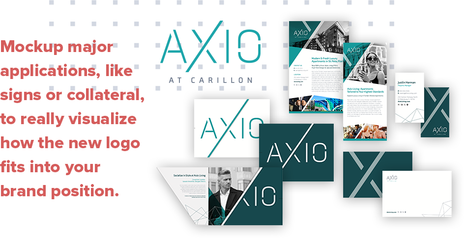
Mockup major applications, like signs or collateral. The presentation needs to show the main applications in a way that allows everyone to really visualize how the new apartment logo fits into and helps the property’s brand position.
Building a Successful Multifamily Brand
Creative pursuits are fun and exciting because processes can vary from person to person. While this process is not the only way, it’s rather important to have some semblance of a process that brings you to the place where your creative output is best. Not only does your creative need to be strong, but you have to have a strategy in mind for what makes an apartment logo design work and why it will help your brand become successful.
Think about apartment logo design like a cross-country trip. If “creative” is the destination, that makes “strategy” the journey. You can’t arrive at your final destination without going on a journey first.
Properties that achieve great multifamily branding find great success. And you don’t have to start this brand journey on your own. Our multifamily marketing agency is here to help! We’re experts on multifamily branding and apartment logo design, so you can focus on building your property (and leases), while we build your brand.

