How to Elevate Your Multifamily Branding Without Overthinking Your Design
In yet another example of how branding is an inescapable reality that all businesses need to address, let’s take a look at multifamily branding. Not so long ago, simply smashing together a couple of aspirational-sounding words in a fancy script was enough. “The Hills at Forestwood” or something like that.
Potential residents have become more brand-savvy over the years, and branding your development with a great name and multifamily logo has become an absolute necessity.
Some groups have done this better than others, of course, and in doing so have created a real brand that speaks to their residents.
Below, we highlighted five of the best multifamily logos we have seen and why they are so successful at conveying an apartment brand personality.

NOVEL
Developed by Crescent Communities, NOVEL is a suite of multifamily brands that includes NOVEL Tampa and NOVEL Deep Ellum (among more than a dozen other brands). The NOVEL logo finds a striking balance between being a modern abstract letterform and also two cropped-in corners of buildings on the top and bottom. The building corners featured in the logo symbolize the multifamily development aspect without being overly direct.
The simple yet engaging multifamily logo also projects movement as the arrows give an allusion to moving up and down. The NOVEL multifamily logo is one of our Creative Director’s favorites as it boasts a sophisticated, elegant, and modern look while projecting a cool design concept.
The NOVEL logo is also a great example of how less can sometimes be more when it comes to your branding, and you do not always need a bunch of colors to make your properties stand out.
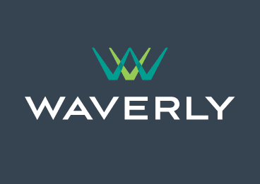
Waverly
For the Waverly, this is a mixed-use development plan with a focus on modern design and progressive building techniques to create a live-work-play environment for the hot Charlotte, N.C. area.
The letters “W” and “V” featured in the logo are simple, elegant, and upscale. With the clean font and contrasting blue and green colors, this multifamily logo is memorable and stands out as being unique yet simply stunning.

Aven Apartments
Another of our design team’s favorite multifamily logos is that of Aven Apartments. This Los Angeles-based luxury apartment community prides itself on offering an electrifying and desirable residential neighborhood with uncompromised views and expansive amenity offerings.
This “electrifying and desirable” atmosphere is well presented in its iconically simple letterform logo. The “A” represented in its logo shows balance, angular direction, and modern design through simplicity. The angular direction of the logo pointing upward also alludes to the community’s high-rise, living-above-all-all-else undertone and messaging.
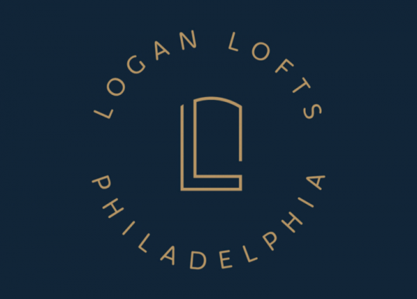
Logan Lofts
Logan Lofts, located in Philadelphia, features a plethora of historical nuances and elements throughout the building and its messaging. As such, these new, modern loft apartments utilize a multifamily logo that strikes a balance between referencing the “L” in the name “Logan” as well as the historical architectural design of the building’s windows. The logo icon is simplistic, balanced, and unique to the specific community.
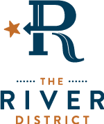
The River District
The River District is a master-planned multifamily development located in Charlotte, N.C. The beauty of its multifamily logo is that it communicates a lot of elements while not being overly busy or complex, which any good graphic designer will tell you is no easy task!
The main letterform is actually a combination of a “D” and “R.” Furthermore, the directional arrow points to a star which signifies that “X” marks the spot. The elongated curve of the “R” also represents the geography of the river that runs through the development as a subtle but prominent feature.
Everything about The River District’s multifamily branding is inspiring and unique, down to its multifamily website and messaging that alludes to a “bountiful community” that is “breaking boundaries.” This multifamily logo is a creative representation of what the community stands for, and it portrays a sense of splendor, adventure, and excitement.
Add Value to Your Multifamily Branding
Logo design is not as simple as sketching at random and hoping for the best, nor is it simply waiting for inspiration to hit you out of the blue. An apartment logo design should be strategic, thoughtful, and yes, even aesthetically pleasing. As any good multifamily designer will tell you (and what our Creative Director tells us often) is that good design adds value faster than it adds costs.
Just some multifamily branding food for thought.
Interested in learning more about multifamily logos and what are the key steps to successful design? Check out our blog for 3 Steps to Successful Multifamily Logo Design.
Subscribe to Blog
Related Blog Posts