How to Identify and Leverage Your Multifamily Brand Storytellers
What is a multifamily brand?
A multifamily brand is a promise for all stakeholders and the inspiration that should drive you to do your best. It is essentially a filter for making business decisions.
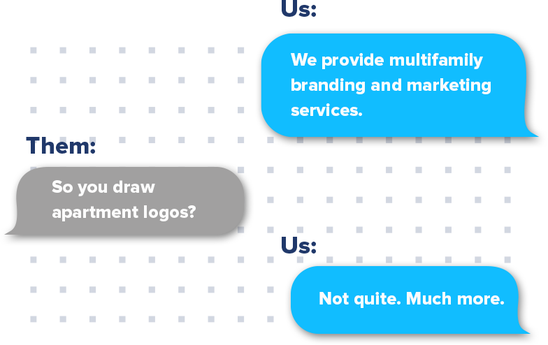
As a marketing and multifamily branding agency, we conduct an unofficial survey on the perceptions of branding every time people ask us what we do.
Many things about a multifamily brand are visual. Design elements, fonts, and colors can evoke a property’s look and feel with just a first impression. And yet, this narrow thinking — or rather, misconception — about what a brand entails is why so many people in real estate are failing to connect with their audience and with a growing millennial and Gen Z demographic.
More Than an Apartment Logo
Multifamily branding is more than a recognizable name and emblem. A brand’s value can be found within the associated perceptions and emotions that it conveys.
Let’s take the Nike swoosh, for example. On its own, Nike’s logo is quite simply a checkmark (that’s the extent of its complexity). And yet, we associate that “checkmark” with concepts and values far beyond itself.
Simply placing the Nike swoosh on a product represents a promise of quality. We associate the swoosh with images of athletes, perseverance, and passion. The final minutes of a championship. The strength and talent are only earned through hard work.
That’s a pretty powerful “checkmark.”

Take any other well-known logo — The Ritz Carlton, Whole Foods, BMW, etc. — and consider what kind of brand images and emotions it triggers. These perceptions, whether consciously or not, guide consumer purchase decisions.
Now apply the same principles of perception to multifamily branding — like a luxury high rise or a neighborhood community.
What brand images are associated with your property? What architectural vision or lifestyle is conveyed?
Creating an Honest Brand From the Inside Out
Our challenge as a multifamily branding agency is finding out how to create a brand experience that resonates with the consumers. We want the experience to be echoed back to the customer in the visuals. The best way to build brand loyalty is by creating an honest brand. Open lines of communication between designers and leaders of the company are essential to designing honestly.
Good brands start from the inside out. The leaders create the vision. The vision creates the visual language. And the visual language turns into a system that is unified enough to be recognized as a cohesive brand. In this way, every communication of the brand is unified, from the way the CEO talks about the company, to the visual language, to the customer service.
How to Better Control Your Multifamily Brand Story
As a multifamily branding agency, we are tasked daily with creating or furthering a story for the brands we represent. However, so often, that story is thought of as one to be consumed via TV, radio, print, outdoor, or the web.
Sure, we all talk about mobile, building responsive websites, useful apps, etc., but it’s not often that we focus specifically on mobile storytelling.
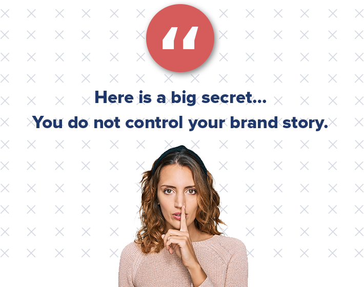
As digital marketers, we pride ourselves so much on our ability to tell a brand’s story, but in reality, we have very, very little control over what that story is.
So, who are your brand storytellers? And how do you approach each of them?
- Your brand → Your brand should always communicate the “why.” People don’t buy what you do, but rather why you do it.
- Advocates → You have to recruit influencers, inspire them to keep advocating for your brand, and reward them for doing so.
- Fans → Your fans like your brand, and hopefully, you’ve been able to build a community around them. But these people aren’t brand advocates just yet. Give these people props when they do talk about your brand, and hopefully, you can convert them into advocates.
- Haters → Your haters will always be there, no matter the industry in which your brand exists. However, you really need to listen to these people and heed the things they are saying about your business, even if you don’t want to hear it. Engage with them, and make them like you.
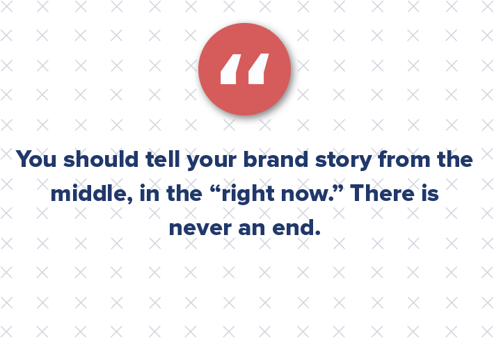
In order to fulfill all of this, brands need to figure out how to tell the story from the middle.
Traditionally, stories have a beginning, middle, and end. But, with social media, your multifamily brand is constantly having to keep up. You should tell your story from the middle, in the “right now.” There is never an end.
Finally, brands need to know which kinds of stories to tell. Tell a story that is inspiring, entertaining, or trending. Tell stories of how your brand cares, and most importantly be human.
Real Estate’s Roadmap to Nike
We’ll let you in on the secret to Nike’s brand success: it was deliberate. In the early stages, the company sat down and asked themselves:
- What is Nike?
- Who are our customers?
- If Nike was a person, what kind of personality traits and values would he or she internalize?
Every great brand has a plan. And in a crowded market, a great brand can resonate and differentiate.
Multifamily branding is more than an apartment logo — it’s an emotional experience, a taste of a lifestyle, and a framework through which to grow.
The first steps of multifamily branding may seem like silly introspection, but don’t be fooled. Building blocks can seem quite simple, until one day they’re a building.
In today’s technological world, people are inundated with content — digital, social, news, books, magazines — the list goes on. In fact, we create 140 million tweets, 1.5 billion pieces of content, and 2 million videos each day. This is why visual information such as infographics is becoming increasingly popular.
Infographics can be an incredibly powerful multifamily marketing tool for your business. According to HubSpot, “businesses that publish infographics grow their traffic an average of 12% more than those that don’t.”
Infographics provide significant value from a content-supporting standpoint. Companies are constantly generating content, but the bulk of it is often heavy and wordy. At our multifamily branding agency, we create content daily for our clients and focus on utilizing the visual aspect of infographics to break up the copywriting.
But the critical balance when designing an infographic is to create the right visual information and present it in the right way to capture your audience’s attention.
Below, we explore the role of infographics in multifamily marketing and five benefits of creating visuals for your audience that we learned as a multifamily branding agency:
1. Storytelling
Infographics can help capture the essence of your content in a very appealing way by telling your readers a story. With imagery and words, infographics allow readers to easily dissect a complex subject and help sustain the reader’s interest. Infographics that simply depict a list of unrelated statistics will lose the audience’s attention. Rather, the infographic should balance compelling text with relevant data to create an efficient and appealing visual.
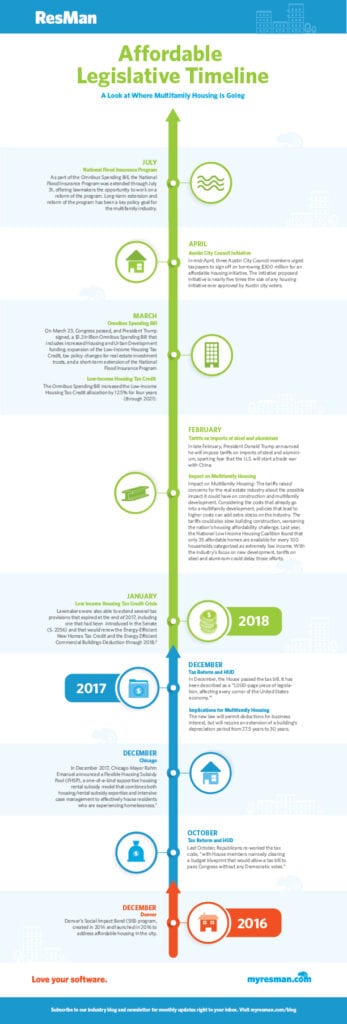
For example, consider this infographic idea below that our multifamily branding agency created for ResMan. The content in this infographic could have been relayed in a blog post, but applying it to a timeline makes it easier to digest and more fun to read.
2. Readability
An infographic can translate heavy blog text into something that is digestible, scannable, and easier to understand. We are such a visually focused culture, and if we cannot scan through something quickly, or have visuals to help complete the thought, the text may not make as strong of an impact. The visual impact that design provides is important in the full understanding of the content itself.
People only see 20% of the text on a page on average during a website visit; infographics allow readers to skim the content quickly to decide if they want to find out more. Additionally, 90% of the information transmitted to your brain is visual. This is why many people would rather look at an infographic than read the text version.
3. Shareability Across Social
Infographics should not only be easy to consume, but easy to share. These visual assets are a great resource for our multifamily branding agency and our clients to download and share across all social platforms.
Blogs may not be a proper fit for sharing on certain social media sites, but infographics can be shared across all platforms to help drive engagement. Pinterest, for example, is geared toward image curation. Pinterest users interested in your business often miss out because you are feeding them the wrong kind of content.
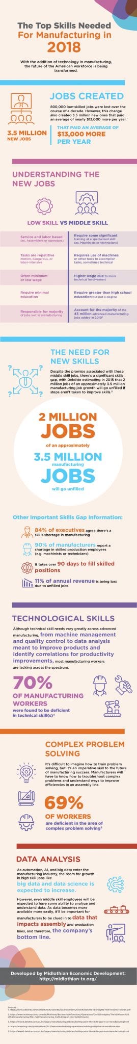
Another great infographic idea is this visual our multifamily branding agency designed for Midlothian Economic Development. The topic is heavy, so translating this into a visual asset with key stats highlighted makes it a much more consumable piece of content — and much more shareable on social media.
4. Brand Awareness
Enhanced brand awareness is another benefit of commercial real estate infographics. Visual content is used as an asset to further promote your multifamily branding and make you an authority or subject-matter expert.
The most important aspect of an infographic is that it should represent and reflect your brand well. Visual content should serve as another consistent piece of multifamily marketing for your brand, and therefore consider design aspects like font, colors, iconography, callouts, etc.
5. SEO and Website Traffic
Commercial real estate infographics are also a great way to drive more traffic to your site to increase conversions and ROI. Think about the last several commercial real estate infographics you saw, and where you saw them. Infographics are prevalent in emails, blogs, advertisements, Facebook, Twitter, and Instagram. One of the biggest reasons companies have found these so useful from a multifamily marketing perspective is because of this versatility; they can make your multifamily branding much more visible.
Additionally, by adding alt text, a title, and a description of the visual asset using targeted keywords, you can boost your website’s ranking on Google. Other ways to boost apartment SEO go back to ensuring your infographic idea is shareable, which would encourage blogs, websites, and even influencers to share your asset and increase your chances of backlinks.
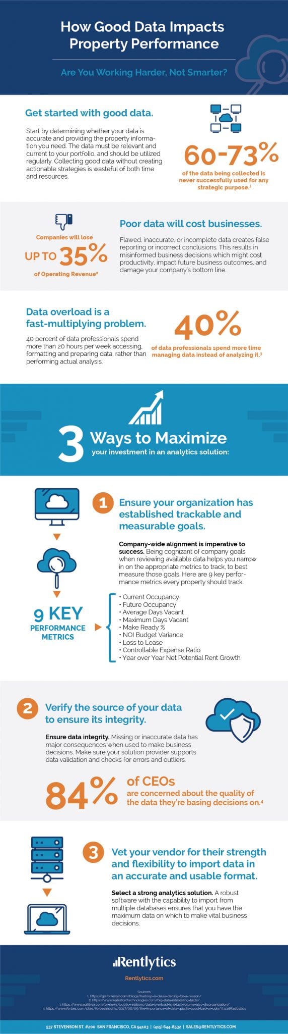
Take this infographic by the numbers below that our multifamily branding agency created for Rentlytics. We took a plethora of stats and data that are normally lost in the shuffle of reports and displayed them in an easy-to-read visual aid. We not only shared this in email newsletters for Rentlytics, but we also included an optimized landing page and links driving to this infographic from blogs. With descriptive alt text and meta details, our multifamily branding agency helped drive a significant amount of downloads and leads through this offer.
6. Less Is More
Sometimes companies try to communicate too much in an infographic, slowing down the reader and negating the benefits of having the graphic in the first place.
Some infographic ideas are over 10,000 pixels long and offer multiple sections and content to consume. Think through the content and story you want to communicate and then create it in a digestible framework.
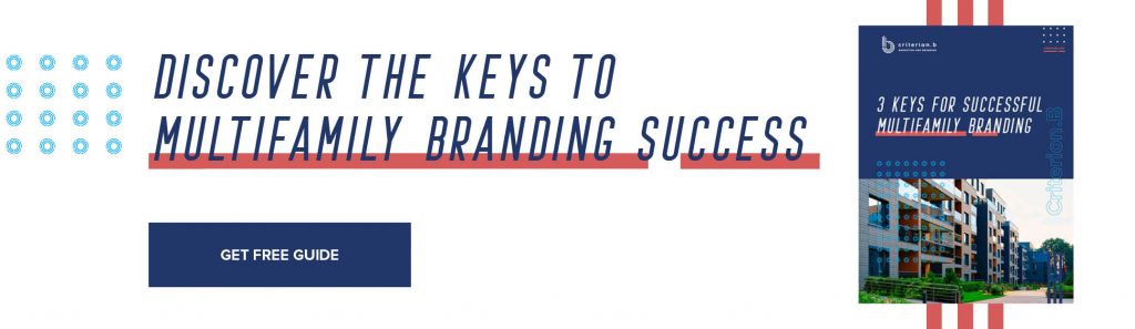
Want more helpful tips like this from our multifamily branding agency? Download our free Multifamily Branding Guide below to get the inside scoop on how to make your brand a smashing success.
How to Elevate Your Multifamily Branding Without Overthinking Your Design
In yet another example of how branding is an inescapable reality that all businesses need to address, let’s take a look at multifamily branding. Not so long ago, simply smashing together a couple of aspirational-sounding words in a fancy script was enough. “The Hills at Forestwood” or something like that.
Potential residents have become more brand-savvy over the years, and branding your development with a great name and multifamily logo has become an absolute necessity.
Some groups have done this better than others, of course, and in doing so have created a real brand that speaks to their residents.
Below, we highlighted five of the best multifamily logos we have seen and why they are so successful at conveying an apartment brand personality.

NOVEL
Developed by Crescent Communities, NOVEL is a suite of multifamily brands that includes NOVEL Tampa and NOVEL Deep Ellum (among more than a dozen other brands). The NOVEL logo finds a striking balance between being a modern abstract letterform and also two cropped-in corners of buildings on the top and bottom. The building corners featured in the logo symbolize the multifamily development aspect without being overly direct.
The simple yet engaging multifamily logo also projects movement as the arrows give an allusion to moving up and down. The NOVEL multifamily logo is one of our Creative Director’s favorites as it boasts a sophisticated, elegant, and modern look while projecting a cool design concept.
The NOVEL logo is also a great example of how less can sometimes be more when it comes to your branding, and you do not always need a bunch of colors to make your properties stand out.
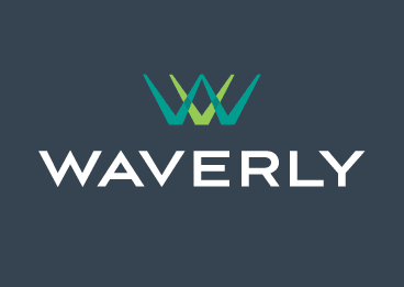
Waverly
For the Waverly, this is a mixed-use development plan with a focus on modern design and progressive building techniques to create a live-work-play environment for the hot Charlotte, N.C. area.
The letters “W” and “V” featured in the logo are simple, elegant, and upscale. With the clean font and contrasting blue and green colors, this multifamily logo is memorable and stands out as being unique yet simply stunning.

Aven Apartments
Another of our design team’s favorite multifamily logos is that of Aven Apartments. This Los Angeles-based luxury apartment community prides itself on offering an electrifying and desirable residential neighborhood with uncompromised views and expansive amenity offerings.
This “electrifying and desirable” atmosphere is well presented in its iconically simple letterform logo. The “A” represented in its logo shows balance, angular direction, and modern design through simplicity. The angular direction of the logo pointing upward also alludes to the community’s high-rise, living-above-all-all-else undertone and messaging.
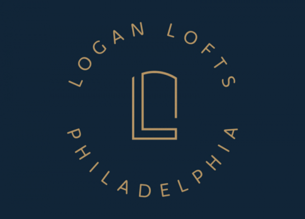
Logan Lofts
Logan Lofts, located in Philadelphia, features a plethora of historical nuances and elements throughout the building and its messaging. As such, these new, modern loft apartments utilize a multifamily logo that strikes a balance between referencing the “L” in the name “Logan” as well as the historical architectural design of the building’s windows. The logo icon is simplistic, balanced, and unique to the specific community.
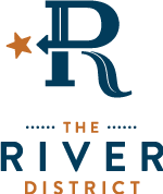
The River District
The River District is a master-planned multifamily development located in Charlotte, N.C. The beauty of its multifamily logo is that it communicates a lot of elements while not being overly busy or complex, which any good graphic designer will tell you is no easy task!
The main letterform is actually a combination of a “D” and “R.” Furthermore, the directional arrow points to a star which signifies that “X” marks the spot. The elongated curve of the “R” also represents the geography of the river that runs through the development as a subtle but prominent feature.
Everything about The River District’s multifamily branding is inspiring and unique, down to its multifamily website and messaging that alludes to a “bountiful community” that is “breaking boundaries.” This multifamily logo is a creative representation of what the community stands for, and it portrays a sense of splendor, adventure, and excitement.
Add Value to Your Multifamily Branding
Logo design is not as simple as sketching at random and hoping for the best, nor is it simply waiting for inspiration to hit you out of the blue. An apartment logo design should be strategic, thoughtful, and yes, even aesthetically pleasing. As any good multifamily designer will tell you (and what our Creative Director tells us often) is that good design adds value faster than it adds costs.
Just some multifamily branding food for thought.
Interested in learning more about multifamily logos and what are the key steps to successful design? Check out our blog for 3 Steps to Successful Multifamily Logo Design.
“Creative office” has become a buzzword in today’s market, particularly regarding workspace design. What is used to describe the types of spaces occupied primarily by marketing and tech companies has become a popular trend across nearly all industries.
This demand is largely derived from an employer’s need to recruit and retain top talent. Most companies now consider their office spaces a recruiting tool to promote company culture and branding.
Let’s take a look at some of the top trends in workspace design:
Prioritizing Employee Happiness in Workspace Design
Employee happiness and wellness are much more prioritized now than in years past. Thus, many companies are looking at the price per square foot and whether their employees will be happy and productive in the location (given that personnel costs and training new employees are a bigger line item than real estate costs).
This means employers are placing a large emphasis on buildings with on-site amenities and services. Properties with fitness facilities, walkability to restaurants (or employees’ apartments), and other shared spaces are desired. Additionally, bright spaces with natural light, especially in interior spaces, are critical as happier and healthier employees are more productive.
Shared Workspace vs. Private Cubicles
Another shift in office workspace design is a greater emphasis on shared areas for employees to collaborate. Private offices, even in more traditional industries, are shrinking and the word “cubicle” makes most human resources directors cringe.
Instead, employers are attempting to give employees more flexibility with breakout rooms and common areas where they can take their laptops and work away from their desks. Additionally, employers are beginning to offer larger kitchens and break areas where employees can feel like they’re in a coffee shop or “hoteling” — where they can set down their laptops at a docking station and go. This is how many millennials want to work (and supposedly) do their best work.
What Are Some of the Benefits of Creative Workspace Design?
- Culture and Branding — A company’s culture can be promoted by designing their workspace. This creates cohesion within the organization.
- Recruiting — Not only can the culture create cohesion within the office, but employers can also use their office space design to create an atmosphere that tells the “story” of their company to prospective employees and other guests.
- Productivity — One’s environment shapes the way one feels, thinks, and works. A creative workspace design can inspire creativity as well as improve employee efficiency.
- Collaboration — Workspaces that encourage collaboration help build that sense of “team” which generally helps with employee retention. Collaboration can also get a company closer to that “big idea.”
- Wellness — Employee wellness is critical as personnel continues to be one of the largest expenditures on a company’s balance sheet. Gone are the days of entry-level employees in dark interior offices with no windows or cubicles. Instead, open layouts with modular furniture and lots of natural light are the norm.
Overall, if your employees enjoy their environment, they are more likely to want to spend time there (i.e., longer working hours without it feeling like “work”).
Take Creative Office Aspects Into Consideration
In Dallas, the most creative office is located near the Central Business District in several distinct pockets, such as the West End, East Quarter, Deep Ellum, and The Cedars. Whether a company is considering a unique 100-year-old brick building or creating this office workspace design in a newer high-rise, business owners must consider these creative office aspects as the generational gap in the workplace widens.
Harnessing the Power of Testimonials to Build Trust in Your Multifamily Brand
When people hear a great story, they look for an opportunity to tell it again to someone new. The same holds in the business world: When you receive exemplary service or purchase a great product, you want to spread the word.
As a multifamily branding agency, we have seen word-of-mouth communication as a powerful force — especially when building brand trust.
Are you more likely to watch a video advertisement or a video that a close friend shared on Facebook? Most likely, you answered the latter because your friend is someone you know and trust.
For most businesses, building multifamily brand trust is of utmost importance, particularly when consumer trust is declining. However, creating an honest brand built on consumer trust does not always require deep pockets or extensive resources. In fact, building apartment brand trust all starts with customer testimonials.
Why Are Testimonials Important for Building Multifamily Brand Trust?
Customer reviews are pure gold for businesses. Why? Because your prospective customers will trust the opinions of your current customers more than they trust your website content, blog, or advertisements.
According to BrightLocal, 85% of people trust online reviews as much as personal recommendations. Moreover, 91% check reviews before making a purchasing decision.
As people research your company and check out your reviews, they become leads that are virtually free to generate. Further, those buyers are more inclined to purchase from you because they trust your customers and your multifamily brand.
At Criterion.B, many of our current clients are from word-of-mouth referrals. As a smaller multifamily branding agency, establishing and maintaining an honest apartment brand is something our team prioritizes for ourselves and our clients. This is why we designed an entire page on our website dedicated to case studies and customer testimonials.
We have also helped our clients incorporate customer testimonials on their websites. (See below for an example from property management software provider ResMan.)
The True Impact of Testimonials
The numbers speak for themselves when using testimonials to build multifamily brand trust.
- 72% of consumers claim positive reviews make them trust a business more.
- Consumers read an average of seven reviews before trusting a business, up from six last year.
- About 50 reviews per product or service can result in a 4.6% increase in conversion rates.
- Consumers are 58% more likely to convert when interacting with your review.
Additionally, testimonials can also drive traffic by increasing SEO. Product-specific content can increase your keyword rankings and search traffic. For example, a business earning 10+ product-specific reviews can increase search traffic by 15 to 20%.
Test the Waters With Experimentation
From multiple-page case studies to video reviews or quick quotes from customers, there are a wide variety of testimonials that you can incorporate into your apartment branding. The important thing is to experiment with the different formats to find what resonates best with your audience. Use your discretion of where and how often you want to display them, and include different types of testimonial content throughout your website and collateral.
Testimonials are one of the easiest and most cost-effective ways to build apartment brand trust, so it’s time to take advantage.
Brand identity is one of the most valuable assets of any business. On the surface, brand identity consists of the name, tagline, logo, typeface, and color palette. But there is more to your brand than these physical traits.
In fact, all forms of messaging run central to your brand and should reflect the value and perception your company is trying to bring to the market. A brand needs to be carefully crafted to represent your business authentically.
Why Is a Brand Refresh Important?
Think about some of the best brand identities in the market. What names come to mind?
According to Interbrands Best Global Brands 2017, the Top 10 Global Brands are Apple, Google, Microsoft, Coca-Cola, Amazon, Samsung, Toyota, Facebook, Mercedes, and IBM.
These iconic brands, with their well-established identities and household awareness, did not start out that way. Over time, these companies have painstakingly built up their brand identity.
Customer needs constantly change, especially in the multifamily property industry as Gen Z renters enter the buyer’s market. As such, your business and its brand identity should be flexible to meet customers’ new and old needs. As your business grows and adapts to the ever-changing market, so too should your brand reflect fresh and up-to-date messaging, imagery, website presence, and social media, all with a clear vision.
Auditing and Assessing Your Brand
As you consider a brand refresh, the first step is to audit and assess your brand and marketing materials. Do they speak directly to the customers you want to reach? Is your key message accurately reflected? Do they represent the lifestyle potential renters can expect?
When auditing for a refresh, it is important to note that your brand does not need to be scrapped. In fact, many key parts — such as your name, services, or product lines — are likely valuable enough to retain and refine.
There is a lengthy list of materials to consider when auditing and assessing your brand, from printed collateral and digital content to mission and vision statements. Consider the following for a full evaluation:
- Mission
- Vision
- Value Proposition
- Competitive Analysis
- Collateral
- Whitepapers
- Case Studies
- Reports
- Internal & External Documents
- Signage
- Digital
- Website
- Social Media
- Display or Remarketing Ads
Keeping the brand message aligned with your core values and mission helps the audience gain a true understanding of your business. One of the most important aspects of auditing and assessing your brand is keeping your message authentic. This helps build trust, optimism, and clarity, and is integral to long-term success.
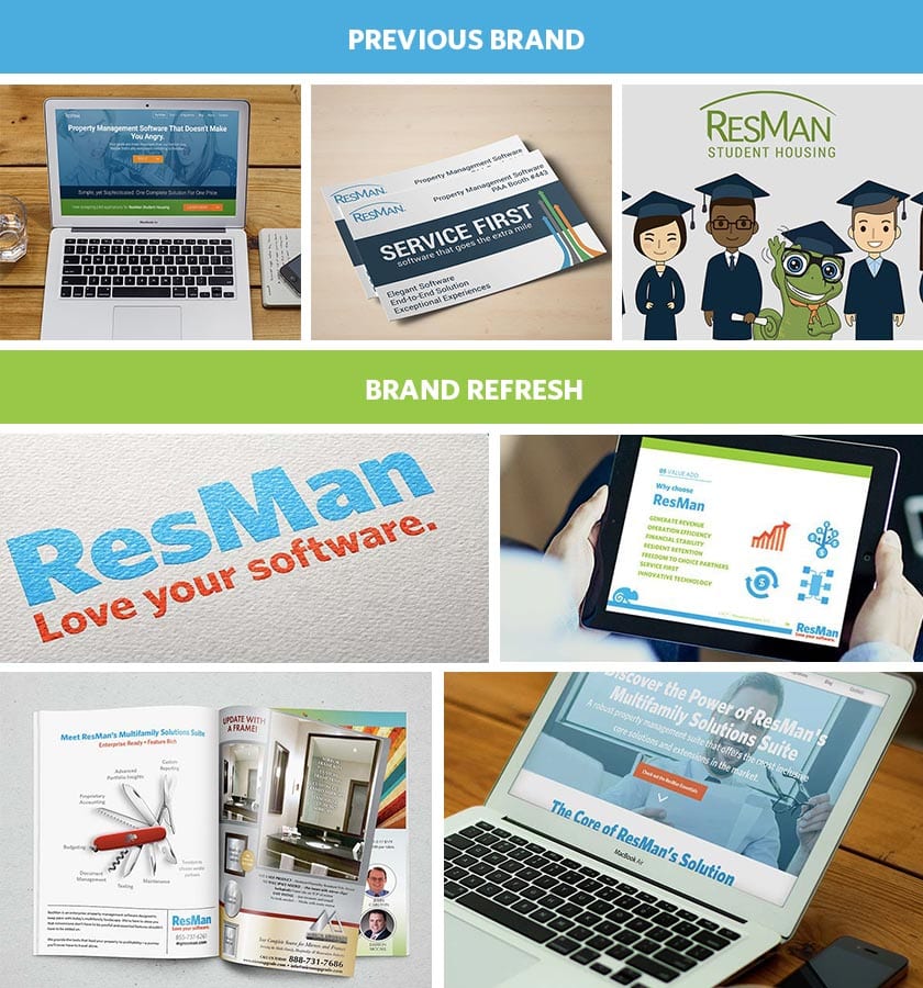
Reinvent, Refresh, Reassess: Case Study
Criterion.B was challenged to reinvent the original ResMan brand into a more sophisticated, trustworthy, and competitive marketplace option. We approached the project with a very thorough “Discovery and Interview” process of key stakeholders to fully understand the changing vision and products for ResMan. Next, we analyzed company insights and growth goals to make sure that the brand updates aligned with their business objectives. Finally, we reviewed the competitive landscape and helped ResMan further define its brand position in the marketplace.
Criterion.B was tasked with embracing the young technology company culture while highlighting a more approachable competitive edge. Thus, we created a vibrant logo, brand guide, new website, and ongoing content strategy. The end goal was a modern brand that still offered a sense of familiarity for the multifamily industry. We updated the original logo character into a stronger icon that promotes ResMan’s dynamic personality.
The end result? Traffic to the ResMan website spiked 268% year over year.
A brand refresh is not taken lightly by the Criterion.B team. As part of the auditing and assessment process, we interview key stakeholders both inside and outside our clients’ businesses. These interviews help us obtain a 360-degree view of the business. We then identify key opportunities with the content, visual language, and business goals to make smart and measurable recommendations.
Promoting a product without knowing who your target audience is (or what they want) is an impossible task. You will just be making decisions based on what you think they want. That is not sustainable over the life of any brand.
That’s why creating user personas is important for any company that wants to grow. The research involved in putting together a user persona report will not only help you understand your target audience it will also help you create a better product for them.
Things like life goals, education level, age, and common problems will determine how you serve these customers in the future — especially when making marketing decisions. Even small factors like location or salary can influence how those people make decisions and, in turn, use your product.
User personas are important for creating a targeted multifamily marketing plan and influencing your growth strategy.
Not sure where to start? Here are 20+ user persona examples, tips, and templates to help you create some amazing user persona examples from scratch:
1. Create 3 to 5 unique and detailed personas to start.
If you are creating your first customer or user persona guides, I would design one for each of your main customer groups. Most resources recommend between three and five distinct personas, and I am inclined to agree.
For example, Michael Szczepanski created four unique user persona examples below; they just happen to be dogs. This is the perfect range to ensure you cover all your bases and gain insight without getting too in-depth.
2. Highlight products your audience already uses in your industry.
Including well-known products in a user persona guide is a simple way to add a wealth of secondary information. For example, if this user only buys Apple products and only shops at Whole Foods, you can make a lot of assumptions rather quickly.
Or, like in this persona guide example for a reading app, the books they love can help shape that persona. I mean, a user who reads romance novels at home will have different needs than one who reads only comics on the go.
3. Use a customer journey map template to help create each persona.
If you have trouble putting together your user personas, a customer journey map may help. This is a great way to look at the customer’s journey from a different angle and hopefully come out with better insight.
Like in the example below, you can learn a lot about your personas by studying how they use your product.
4. Use icons to emphasize information in your persona guides.
I am a huge fan of icons and illustrations, especially infographics. These little visual helpers allow you to add context and information rather effectively. Plus, people are relatively familiar with icons, so there is no learning curve.
Because of that, they can also be used on a persona guide to illustrate a complex concept or idea. Just take a look at the below example there are a plethora of useful icons. From the music icons in the interest section to the ones that help illustrate and organize the guide.
5. Find a common metric to track across your different personas.
When analyzing your different user personas, you should try to have at least one similar metric between them. Otherwise, you will compare abstract things like their bio, keywords, or some other written metric.
Something like a score or point can generally be compared across the board. Then, you can use icons like stars to visualize these metrics, like in this user persona example from ABWS Digital.
6. Keep layouts consistent between persona guides.
Other than creating one of the most unique persona examples in this collection, this example from Shopify does something exceptionally well, almost as well as they know e-commerce, entrepreneurship, and inventory management. The designers kept the layout consistent throughout each card.
Consistency is key when creating a compelling user persona because it allows quick comparisons. It is inefficient to have people aimlessly search for information because the designer wanted to switch things up.
7. Visualize persona data memorably.
Providing real stats and metrics is a fantastic way to take your persona guide to the next level. But make sure that the data you are presenting is useful and memorable.
As seen in the example below, you can achieve this by creating data visualizations. By combining icons with important data, the designers could create a visual that can be easily recalled.
If you have little (or any) experience creating data visualizations, starting with a user persona guide template can help.
8. Highlight the differences between your personas.
Different people have different goals, problems, and preferences. To help keep your marketing campaigns segmented and your product features focused, it can be helpful to highlight the differences between your personas.
Take a look at how this user persona example uses pie charts and custom illustrations to show the differences between each type of person:
9. Turn your user persona guide into an infographic.
Infographics are an outstanding way to communicate visually. So, why not turn your persona guide into an infographic?
The designers at LOLSMG used visuals like icons, decorative fonts, and conceptual images to make their user persona guide more engaging. Plus, there are already a ton of free infographic templates that you can use as a starting point.
10. Make sure the designs reflect the personas.
To make your user persona guides more memorable, use design elements that reflect each individual persona. Consider how you can use design to reflect their age, jobs, and interests. For example, if one of your personas is a 20-something in the tech industry, use bold, quirky fonts or colors in their persona guide.
Look at this gamer user persona and how the design reflects his interests and problems.
11. Research your users’ motivations and pain points, then highlight them.
When you start the research into specific personas, it is important to look at the motivations and pain points. A few guides I saw while collecting user persona examples focused on only one or the other.
To truly create an accurate user persona, you must thoroughly research your users’ motivations and pain points.
For example, this highly qualified influencer finds it difficult to attend events (maybe because he’s a cat), and maybe your product can help them out.
12. Include goals that your product or service may not directly impact.
The goals that your product or service directly impacts should be featured in user persona examples. But you should also take it a step further and highlight the other goals this persona may have.
Maybe your product is a fitness app, like in the example below, which features traditional and nontraditional health goals. These indirect goals may not be something your product will influence or impact, but they are still important in understanding the persona.
13. Begin your user persona guide with a helpful introduction paragraph
Part of creating a well-rounded user persona is giving them a backstory. It does not have to be much, but enough to help highlight key traits or aspects. You can use this intro to talk about what makes your personas tick. Outline why your company should care about this persona. Or make it purely biographical, like in the user persona example above.
I like this approach because you can use it to tell a real story instead of just listing facts and figures.
14. Design a fully visual persona.
There are no rules that say your user persona has to be a document, a poster, or even an infographic. Honestly, it can be whatever helps your brand build better experiences for your users.
If you can create one that does not fit into traditional conventions, as Jason Travis did below, then more power to you. I mean, with just a handful of items, he was able to paint a rich tapestry for each user.
15. Include details like geographic location and salary range.
Location and salary are extremely useful, especially if your customer base is primarily in one geographic region. This user persona example from GB Lee featured both, but some guides omitted it completely.
Consider how different customers live in LA and NYC or how different the rent is when living in San Francisco and Kansas City.
Those are massive things you cannot ignore, or your user persona guide will be a wasted effort.
16. Use sliding scales to define a user accurately.
Generally speaking, the more specific your user persona guide is, the better. Take a look at the previous tip to see a few of those concrete factors. However, other sections or factors are better defined if there is a little more gray area.
In this example, personality traits are more accurate if they are graded on a scale. It is better to say that Rory is a bit more introverted than extroverted. Labeling him at either extreme would paint an inaccurate picture.

17. Assign each user persona example a real name.
Thinking about these personas as actual customers or people can make developing personas more effective. That is why assigning them a real name is so essential.
Take a look at this user persona example, if they had used a single keyword or something like “Runner McGee,” the facade is broken immediately.
Then, you risk your user persona guide being another document your team ignores. Your personas should guide your multifamily marketing plan.
18. Break down a day in the life of your user persona.
To help think like your persona, it can be helpful to imagine what a day in their life is like. An easy way to illustrate a daily or weekly routine is by using a timeline infographic. You can use icons to illustrate the different activities they do or obstacles they face.
Like Monica Miller did in the user persona example below, you can impart much information in a rather small package.
19. Present all personas guides on one page for easy comparison.
Comparing the similarities and differences between your personas can be helpful when creating your marketing plan. You can make comparisons easily by showing your personas on one comparison sheet (or even a comparison infographic).
In this user persona example, they presented all three personas on one graphic. You can compare each aspect in milliseconds instead of swapping screens or shuffling papers.
20. Summarize each user persona with a few keywords.
What drives each of your user personas? Try and summarize them in a few powerful keywords.
These user persona examples come from our friends at Mailchimp. I can confidently say they are my favorite in this roundup.
Not only are they visually unique and can be used as posters around the office, these guides also tell you all you need to know about each persona with only a few keywords.
21. Highlight social media or tech use.
The social media platform or technology a persona uses daily should be included in each guide. This tip (and user persona example) is especially useful for any internet-based brand or company. Not knowing both of those factors could spell trouble from the beginning because if we were to target one of these personas on the wrong device or platform, all our efforts would be a waste.
So, take the time to find out where your personas are hanging out and what device they use to do that.
22. Never use recognizable faces or celebrity photos.
I mentioned already that you should give each persona a real name, and the same can be said when using images or headshots.
Creating the impression that this is a real person is key, so do not use celebrities, people from your office, or recognizable faces. This could lead to people subconsciously adding traits from these people to the personas.
In this user persona example, they did the right thing and used a random person. It is almost like you are looking at a blank slate, which is ideal.
Now that you know how to create an ideal user persona, it’s time actually to go do it! These are going to take a while and involve a lot of research but do not get discouraged. In the end, they will be worth it because you will be able to help your customers better. When in doubt, start with a persona guide template.
Ryan McCready is the Content Editor and Design Analyst for Venngage. He graduated from the University of Arkansas with a degree in economics and international business.
The Power of Responsive Web Design: Benefits, Best Practices, and Competitive Edge
In today’s digital landscape, the demand for mobile-ready websites is paramount as more individuals rely on smartphones and tablets to access information online.
Mobile devices serve as more than just tools for internet browsing; they facilitate social networking, email communication, video consumption, and product research. This surge in mobile usage necessitates adopting responsive web design, a critical approach to multifamily web development that enables websites to adapt seamlessly to various device screen sizes.
What Is Responsive Web Design?
Responsive web design is an approach to apartment web design that allows a website to conform to the size of the device’s screen. With responsive design, elements are built on a flexible grid, which allows them to reorganize based on the screen size. As a result, this allows a multifamily website to be viewed seamlessly regardless of the device.
Creating a responsive multifamily website means you don’t have to create multiple designs or maintain a separate mobile site. Rather, the existing elements respond to any screen. Consequently, this makes it easier for people to navigate your website from any location or device.
If you’re trying to figure out whether you should create a responsive design for your business, here are five practical benefits of responsive web design:
The Benefits of Responsive Web Design:
1. Increases website visibility on search engines.
Responsive web design enhances website visibility and accessibility. With a single responsive design, you can consolidate your multifamily SEO efforts and concentrate on optimizing a single website. This streamlines your SEO strategy, enabling you to create quality content that improves your website’s search engine rankings.
Plus, Google rewards mobile-friendly websites with a better ranking in SERP for mobile searches.
2. Improves multifamily website reach.
A responsive design ensures that your multifamily website reaches a broader audience. As the sales of tablets and smartphones continue to soar, catering to users across different devices becomes essential. A mobile-friendly website expands your reach and enables you to engage with a wider target audience.
3. Boosts your mobile conversion rate.
Another great benefit of responsive design is improved mobile conversion rates. Not only do your search engine results improve when implementing a responsive web design, but with ease of navigation, people can travel more seamlessly through your sales funnel. Simplifying the user journey reduces barriers. The fewer hoops people have to jump through on your multifamily website, the more likely they’ll make a purchasing decision.
4. Improved user experience.
Responsive design gives visitors a much better user experience when visiting your website. Your visitors will no longer need to pinch their screens to enlarge your website’s text. Instead, they can browse your multifamily website, view images, and read content without manipulating their device’s screen.
5. Competitive advantage of responsive apartment web design.
As a business owner, you need to stay ahead of your competition. If you notice more of your customers using mobile to make purchases and you’re not mobile-ready, your competition’s responsive multifamily website becomes much more attractive to customers.
The bottom line: If you want to stand out as an industry leader, you need to follow responsive web design best practices. This will be vital to the success of your business in the years ahead.
Responsive Web Design Best Practices:
To ensure optimal results, consider the following best practices for responsive web design:
- Prioritize mobile-friendly and intuitive navigation.
- Optimize content layout and readability for different screen sizes.
- Compress images and optimize page load speed for improved performance.
- Implement touch-friendly buttons and interactive elements.
- Test and validate the responsive design across multiple devices and browsers.
- Stay updated with the latest trends and advancements in responsive design tools and technologies.
Responsive web design is an indispensable tool for today’s business owners. You must design a responsive website to attract more customers, create a better user experience, and stay ahead of the competition.
A mobile-friendly website expands your reach, increases your mobile conversion rate, and optimizes your online presence. Embrace these responsive web design best practices to ensure your business’s success in the years ahead and remain at the forefront of the evolving digital market.
Boost Mobile Conversion Rates: 5 Essential Strategies for Success
The jury might still be out on the mobile conversion rate power of QR codes, SMS, and NFC, but if your business fails to see results, it’s probably worth rethinking your strategy on how to increase mobile conversion rate.
While these mobile conversion tools initially held great promise for multifamily marketing professionals, they have fallen short of expectations. Understanding the mobile user is key to optimizing your apartment marketing efforts on mobile.
In theory, QR (Quick Response) codes are an efficient way to drive traffic to a multifamily website or landing page; SMS (Short Message Service) allows you to communicate with your audience on a platform that’s personal and direct (i.e., texting); and NFC (Near Field Communication) uses location to deliver relevant messages or offers.
Such mobile conversion rates initially seemed like a dream come true for marketers. Suddenly they offered a direct route to customers’ pockets and accelerated the transaction process. It may even be greener, too.
However, QR codes, SMS, and NFC haven’t quite met their promise. This deflation of potential has probably resulted from a failure to understand the mobile user.
When it comes to optimizing your multifamily marketing efforts on mobile, here are five things to keep in mind:
1. Embrace a mobile-friendly design.
The importance of mobile-friendly apartment web design cannot be overstated. If your multifamily website fails to provide a seamless experience on mobile devices, you risk losing customers. Touch screens have revolutionized our interfaces but also made them less precise. Cursors have been swapped out for our fingertips, and anyone struggling through a poorly rendered page desperately wants the product at the end. That’s preaching to the converted.
Your multifamily website should be designed to cater to the limitations of mobile interfaces. Ensure that it loads quickly, has an intuitive layout, and offers a user-friendly experience for customers on the go.
2. Grab attention from the start.
Mobile users have limited attention spans, so it’s crucial to seize their attention as soon as they land on your page. Remember, they may be multitasking or engaging in quick browsing sessions. Present your most compelling offer or deal prominently in the first fold of your webpage. Make sure your message is clear, concise, and visually engaging. Mobile users want instant gratification, so make it easy for them to understand the value proposition right away.
3. Keep messaging clear and concise.
It should be obvious what the customer gets and what, if anything, they’re giving to you in return (e.g., an email address). Again, you don’t have much time, so do this in as few words as possible and make your images paint the rest.
With limited screen space, it’s important to communicate your message effectively and efficiently. Use concise and engaging language paired with visually appealing images to convey your offer. Keep your offers simple, focusing on immediate gratification. Avoid complex combinations or lengthy menus of different offers that confuse and deter potential customers.
4. Simplify the payment process.
The payment process should be smooth, quick, and frustration-free. Once a customer has decided to make a purchase, ensure the payment process is streamlined and intuitive. Minimize the number of steps required to complete the transaction. Customers should not encounter any unnecessary barriers or confusion during the payment process. A hassle-free payment experience can make a big difference when determining how to increase mobile conversion rate.
5. Foster engagement and retention.
The ideal customer is a returning one. Nurturing returning customers is key to long-term success. Keep your web presence up-to-date and engage customers with fresh and relevant content. Regularly roll out new offers and promotions to keep customers excited. Maintaining an active and engaging online presence will secure customer loyalty and encourage word-of-mouth referrals and recommendations.
Unlocking Higher Conversion Rates With Effective Strategies
To enhance your mobile conversion rate, it is crucial to prioritize mobile-friendly apartment web design, deliver clear messaging, and foster ongoing engagement. By understanding mobile users’ unique needs and behaviors, you can optimize your multifamily marketing strategy and improve your mobile conversion rate. Embrace these strategies and stay ahead in the dynamic world of mobile marketing to drive successful conversions and foster customer loyalty.