It’s crazy to think that an average of 95 million posts are uploaded onto Instagram daily. Even in our own networks, we are bombarded with numerous photos daily that we often succumb to an aimless scroll — seeing but not really retaining.
When it comes to social media for apartments, we pause to see something that really catches our eye. Whether it’s vibrant food or a scenic location, something about that image stops us in our tracks.

Here are some tips on how to enhance your multifamily marketing strategy:
1. Don’t be in the shadows.
Lighting might be one of the first aspects to stop someone in their tracks. Brighter images will draw attention more often than darker ones. Play with brightness settings to increase light in specific areas or in the entire image. Take advantage of natural lighting. Especially when highlighting details in food or texture, brighter or natural lighting allows for clarity and proper emphasis on specific aspects of the shot.
2. Make it pop.
Color is key. Bright, vivid images are a great way to catch one’s eye and draw attention to a post. No matter the subject in the frame, try to include colorful objects or even add some filters or effects to boost the color. With that said, make sure your use of color sticks to your theme or brand tone. If you’re running an account for a company or brand, ensure you don’t stray too far from their tone and color scheme. It’s very easy to get carried away with bright colors that you completely forget who you’re posting for.
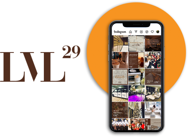
Take @lvl29life on Instagram as one example. The luxury apartment community’s overall Instagram feed is aesthetically pleasing and in tune with the brand’s color scheme and multifamily branding. LVL 29 utilizes high-quality photography and design to create social media graphics that are cohesive, engaging, and unique to the brand.

3. Focus, focus, focus.
When highlighting a subject, play with foreground and background. Most commonly done with food, put your subject in focus and blur out the background. This technique blatantly directs the viewer to see the most compelling part of your image.
A purposeful focus adds texture and depth to your image in unexpected ways. A general approach to any of these images would position the subject on a table with nothing too exciting about it. By focusing the camera on the subject, the photographer captured the object’s detail while allowing for greater context on the outer part of the frame. Whether the background is bland or has more action going on, focusing helps to organize what’s important in the frame and when done well, can look quite striking.

For example, a multifamily property might want to highlight its resident dog park on social media. Rather than simply sharing an image of the park, ask one of your residents to pose their dog in the park while you take a picture of the dog in the foreground, with the park slightly blurred in the background. Playing around with the focus of the image and making sure your residents (and their pups) are the star of your photo is a creative way to showcase your property amenities without being overly salesy.
Interested in more multifamily marketing tips for your social media? Check out our other blog, 4 Tips to Get the Most Out of Your Socia Media Strategy.
4. Don’t be boring.
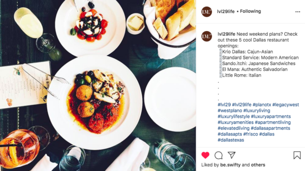
Depending on your posting, variety may be a good attention-grabbing tool. Adding an assortment of objects and textures to an image can tell a greater story than expected. People are quick to look past singular images. By adding multiple objects into the frame, the viewer is invited to spend more time looking at the post and absorbing every part. With variety, your eyes are fed with new and different images around the frame, sparking curiosity about what all these objects have in common.

5. Position with a design eye.
Instagram allows anyone to become a photographer instantly. When taking and editing images, consider the positioning of your subject relative to the things around it and your perspective to capture the image. If you’re taking pictures of food, approach it from unconventional angles or perspectives that make even the blandest piece of toast look enticing.
If you’re taking pictures of nature, walk around and take a number of different pictures at different angles and distances to compose completely different images. Experiment with angles and positions to bring a creative edge to your image. Two images of the same object can look completely different with different angles and positions.
6. Experiment with videos and Reels.
Did you know that 9 out of 10 Instagram users watch videos daily? Never underestimate the power of video on social media. Video allows you to go beyond static images to capture viewers’ interest. Instagram offers several ways to share videos, including on your Stories, feed, IGTV, and Instagram Reels. Instagram’s latest algorithms put a significant focus on video, primarily Reels. It’s time to find a trending Reels sound and get creative with your content!
7. Use design apps like Canva.
Even if you don’t have a graphic design team in-house, that doesn’t mean your Instagram posts always need to be static content and Stock images. Design apps like Canva offer anyone the ability to create unique and branded posts with a few taps on their keyboard. Be sure to upload your fonts and hex codes for your brand colors to ensure your content is consistent and cohesive with your multifamily branding.
Want to see this in action? While our graphic design team helps us create most of our posts, our content team also utilizes design apps to enhance our feed. Follow us on Instagram to see for yourself!
8. Have fun.
No one said Instagram had to be serious. Have fun with what you share. Use every post as an opportunity to experiment with any of the above tips and bring new life to your account. Don’t be afraid to get weird or quirky. It’s the odd things that make people stop and stare.
For more multifamily marketing tips and tricks, don’t forget to follow us on Instagram!


