For twenty years, we designed websites for one kind of visitor: a human with eyes, a cursor, and roughly eight seconds of patience. We optimized for the hero image, the scroll animation, the button that begged to be clicked. Beauty was the brief.
That visitor still matters. But they’re no longer the only one showing up — and increasingly, they’re not the one arriving first.
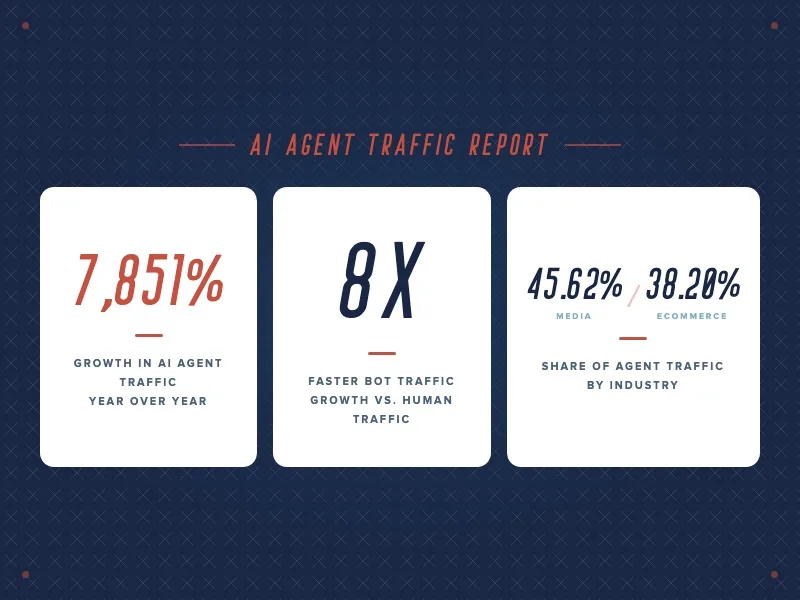
Traffic from AI agents and agentic browsers grew 7,851% year over year, and automated traffic is now expanding eight times faster than human traffic. Tools like Perplexity’s Comet and OpenAI’s Atlas are visiting your site, reading it, and answering questions about you before a person ever loads the homepage. The media and ecommerce categories alone are absorbing the bulk of this activity, at 45.62% and 38.20% of observed agent traffic respectively.
Here’s the uncomfortable part: the things that make your site feel premium to a human are often the exact things that make it illegible to a machine.
The Tension Nobody Designed For
A bot doesn’t experience your brand the way a person does. It never sees the cinematic hero video or feels the weight of your typography. It reads structure — the markup, the semantic hierarchy, the data underneath the design.
So when your headline lives inside a JPEG, when your pricing is baked into a graphic, when your value proposition only renders after three seconds of JavaScript, a human sees a gorgeous, confident brand. An agent sees a blank space. You’ve built a showroom with no signage — dazzling to walk through, impossible to catalog.
This is the quiet war that’s been running underneath every “make it pop” design review: human resonance and machine readability have been pulling in opposite directions, and most brands picked a side without realizing it.
The ones that picked “beauty” are discovering that a website which looks stunning to a person but reads as empty to a bot is, functionally, a dead website. It can’t be cited, summarized, or recommended by the systems that now mediate discovery.
Stop Choosing. Start Designing in Two Layers.
The instinct here is to frame this as a trade-off — as if you have to sacrifice elegance for structure, or strip your site down to plain text to please the robots. That framing is wrong, and it’s costing brands their best instincts.
The reframe is this: you’re no longer designing one website for one audience. You’re delivering one experience through two rendering paths. There’s the visual layer — the emotional, human-facing surface that makes someone feel something about your brand. And there’s the semantic layer — the clean, structured, machine-facing scaffolding that makes an agent know everything about your brand. These are not in competition. They’re two outputs of the same intentional design system.
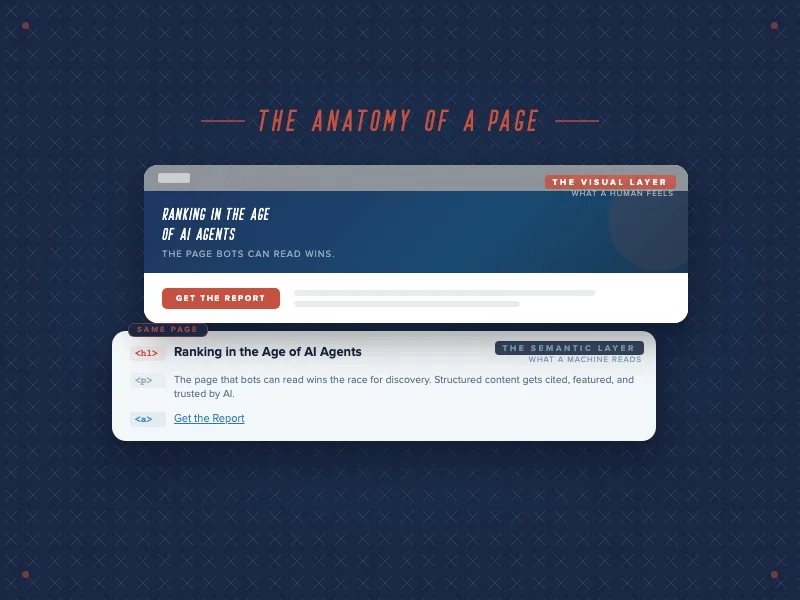
A human feels the brand. A machine reads the brand. The winners in 2026 are building both on purpose, not leaving the second one to chance. This is the natural next move beyond the credibility argument we made in The Interpretability Standard: it’s not enough for a machine to verify you exist. It now has to be able to navigate you.
What Dual-Design Actually Looks Like
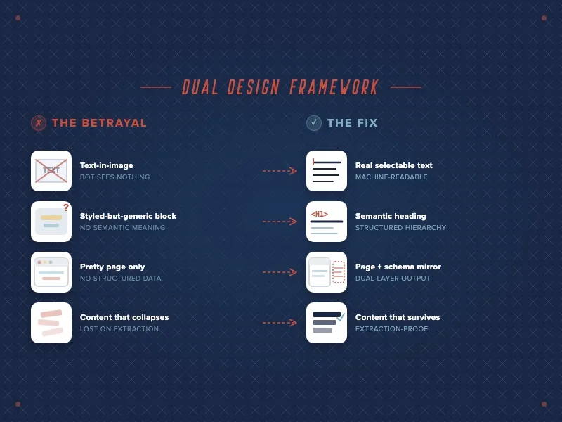
This isn’t about “adding SEO keywords.” It’s digital infrastructure. A few of the places where the two layers either align or quietly betray each other:
- Content that survives extraction. When an agent strips away your navigation, footer, and scripts, what’s left should still tell the whole story. If the meaning falls apart without the visual context, the meaning was never really in the content.
- Text as text, not as image. That elegant headline locked inside a graphic is invisible to an agent. Keep the visual treatment, but make sure the words exist as real, selectable, structured text underneath.
- Semantic HTML over visual-only styling. A heading that’s styled to look like a heading but coded as a generic block tells a machine nothing about hierarchy. The structure has to mean what it shows.
- Structured data as a first-class deliverable. Schema markup, clean metadata, and a machine-readable mirror of your key content aren’t technical afterthoughts. They’re the version of your site the agent actually reads.
We’ve written before about treating your online presence as a data feed in The Invisible Brand. Dual-design is where that idea meets the canvas — the point where data architecture and visual identity stop being separate disciplines.
The Lens to Carry Into Your Next Design Review
The next time a beautiful comp lands on your desk, ask a second question. Not just “How does this make someone feel?” but “What does this say to a machine that can’t see it?”
Because the funnel has already changed shape. As we covered in From Keywords to Conversations, discovery increasingly happens inside an AI’s answer, not on your homepage. The agent is now a gatekeeper standing between your brand and the human you actually want to reach. If it can’t read you, it can’t recommend you — and the person on the other side never gets the chance to feel anything at all.
That reframes the whole job. Machine readability isn’t the enemy of brand emotion. It’s the delivery mechanism for it.
The Winners Make a Human Feel and a Machine Know
The brands that win the next few years won’t be the ones that chose between gorgeous and legible. They’ll be the ones who refused the choice — who built sites that make a human feel something while making a bot know everything.
Your most important visitor this quarter might not have eyes. Design like it.
Share This Article


Subscribe to our newsletter
Related Blog Posts